
Your landing page’s weakest score is Information hierarchy.
How Fero Labs ranks
68Growth scoreupdated
category scores
category scoresShowHide
Information hierarchy
66FairDoes the design help or inhibit what the page is trying to say?
 1234
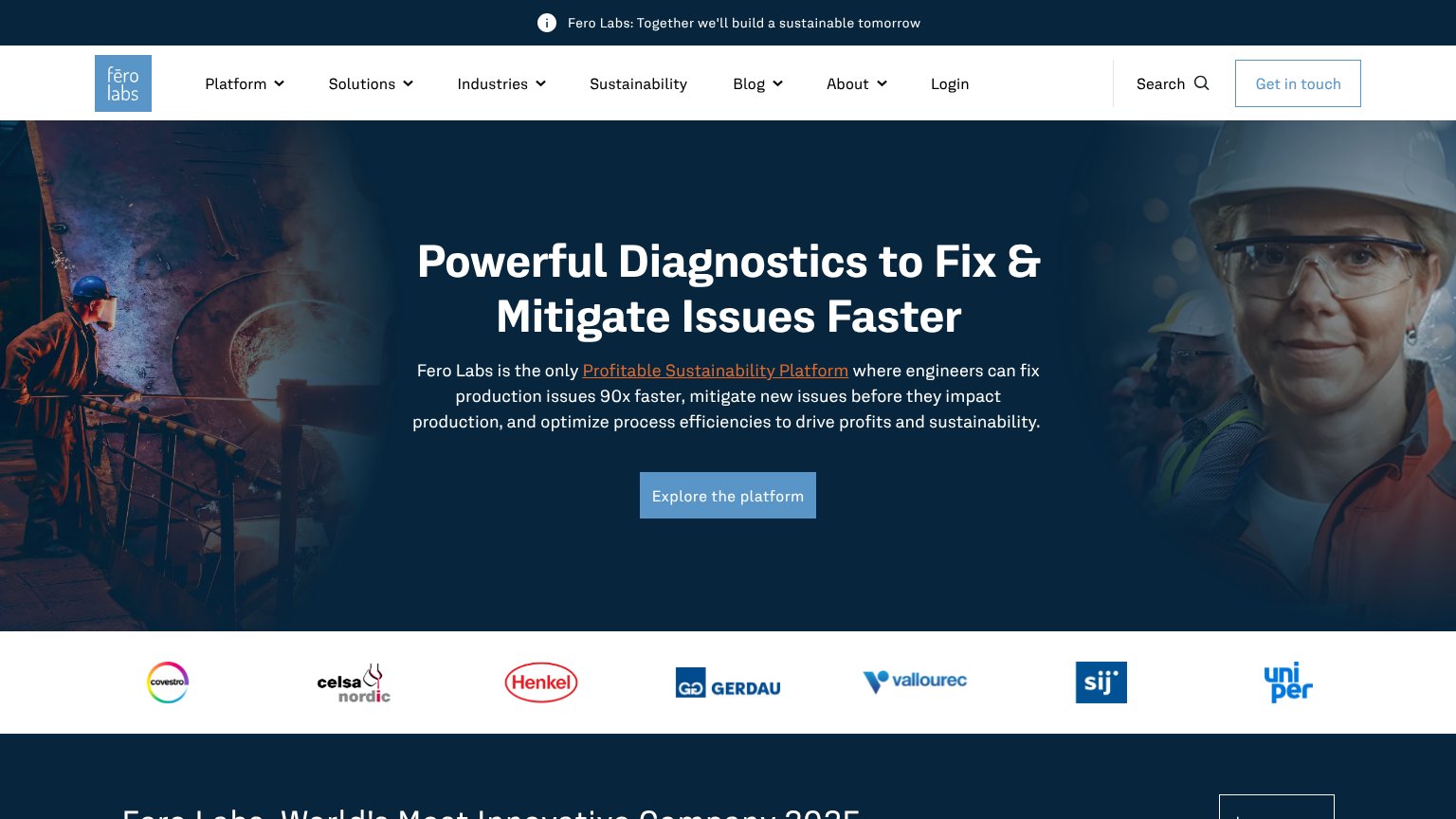
- Explore the platform CTA — Muted slate-blue fill blends into the dark hero photo, so the one conversion action fails the one-second find test.
- Inline subheadline link — Underlined 'Profitable Sustainability Platform' link sits inside the value prop and routes readers away before they reach the CTA — it renders bright orange on mobile, outshining the button.
- Navigation link row — Six dropdown items plus Search and Login create ten exit paths that all outweigh the low-contrast primary CTA.
- Get in touch button — Outlined secondary CTA in the top-right scan terminus competes with 'Explore the platform' for the click.
CTA
68FairCopy, size, verb, cost-feel — does the primary CTA earn the click?

Problems
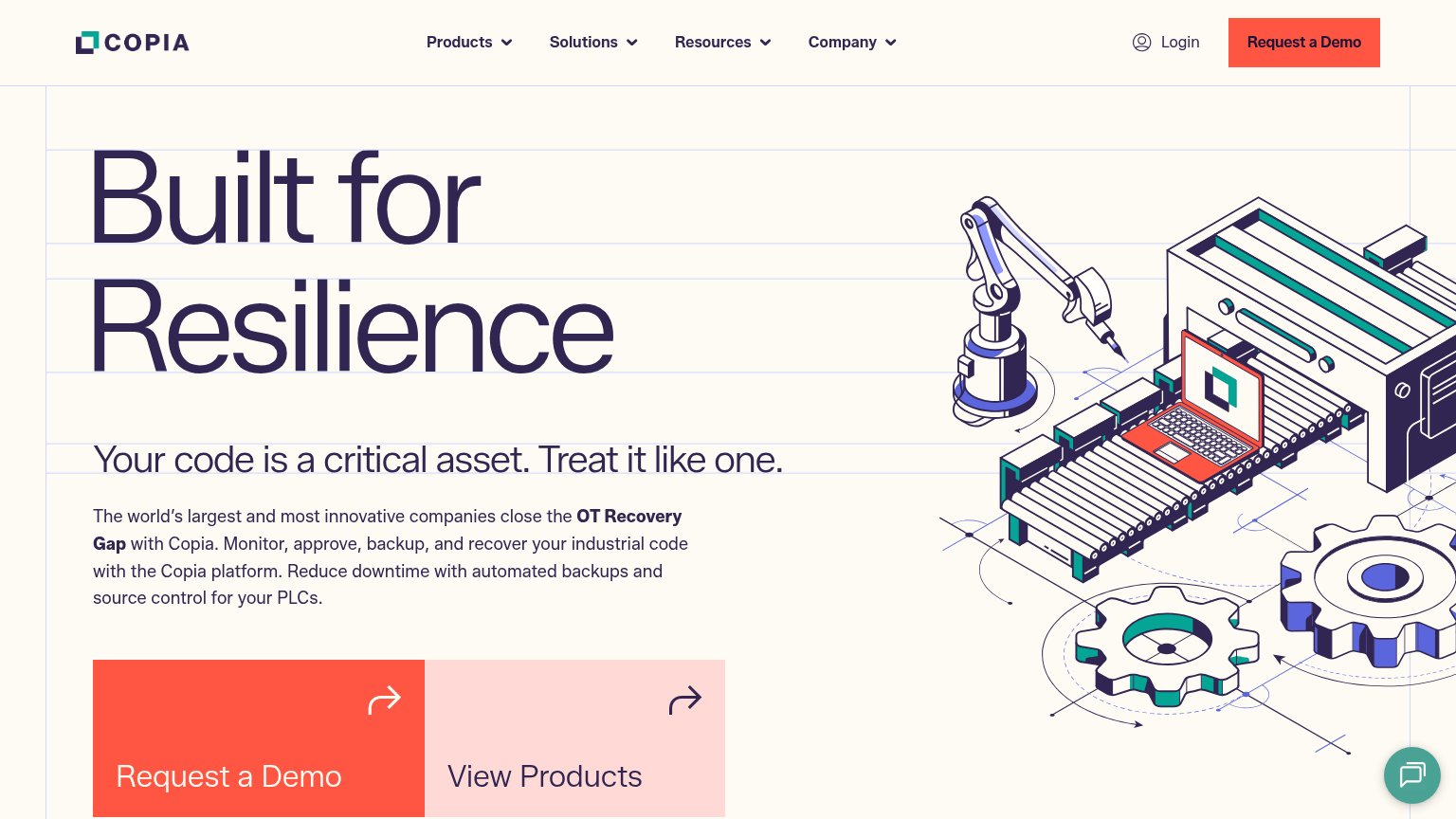
- 'Explore' is vague, no payoff
- low contrast on dark hero
- nav CTA 'Get in touch' competes
Trust
68FairProof that the product is real, competent, and safe to try.
How Fero Labs compares
Trust read
Mobile web
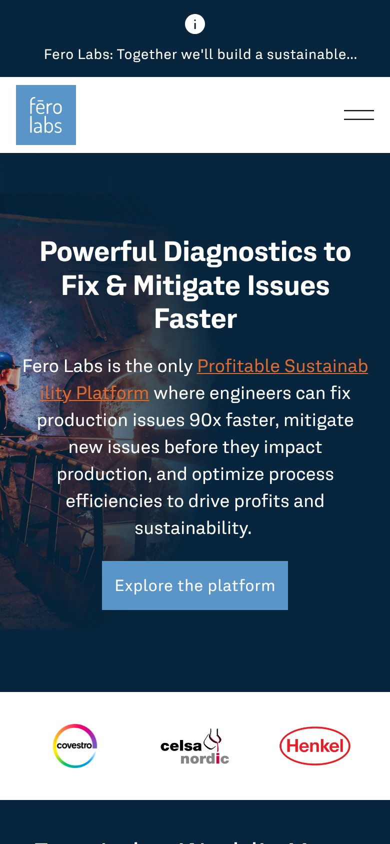
68FairThe phone experience as a first-class citizen.
What works
What to improve
Value props
70FairTitle, subtitle, hero — do they sell the product's true value?
Fero Labs’s headline
Powerful Diagnostics to Fix & Mitigate Issues Faster
Fero Labs is the only Profitable Sustainability Platform where engineers can fix production issues 90x faster, mitigate new issues before they impact production, and optimize process efficiencies to drive profits and sustainability.
Working
Could improve