
Your landing page’s weakest score is Trust.
How Captions ranks
70Growth scoreupdated
category scores
category scoresShowHide
Trust
56FairProof that the product is real, competent, and safe to try.
| Trust read | |
|---|---|
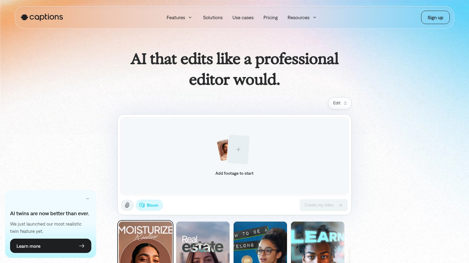
| Captions | Embedded editor widget: "Add footage to start" with "Create my video" button and example output thumbnails |
| Realistic UGC-style skincare video frames with Korean captions arranged in a content-flow diagram | |
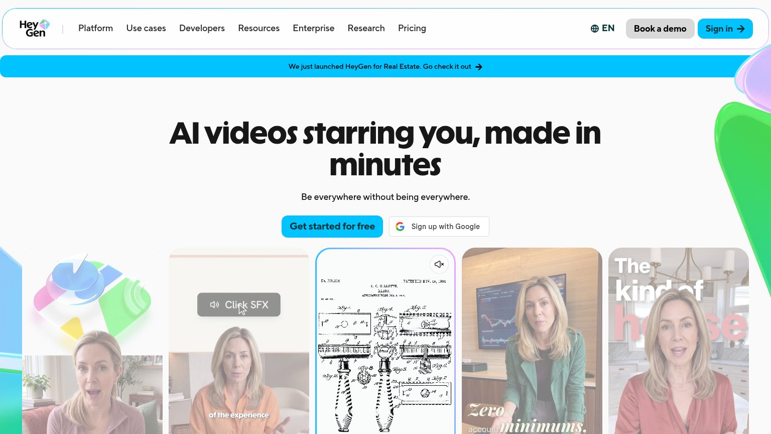
| Row of realistic AI avatar video examples beneath the hero showing generated talking-head clips | |
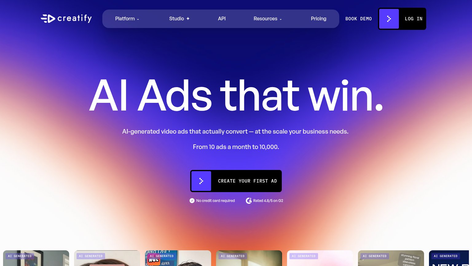
| Rated 4.8/5 on G2 | |
| No visible trust signal identified. | |
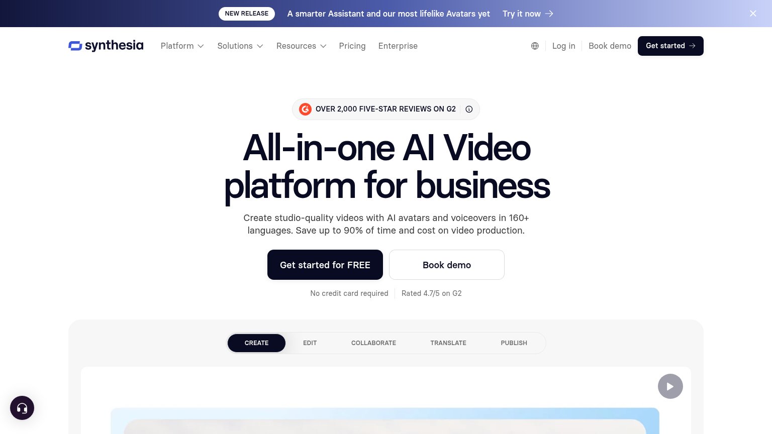
| "OVER 2,000 FIVE-STAR REVIEWS ON G2" badge above the headline |
Information hierarchy
68FairDoes the design help or inhibit what the page is trying to say?
1234- Create my video button — Grayed disabled styling makes the primary CTA read as inactive and invisible in a one-second scan.
- Learn more popup — Solid-black button is the highest-contrast element in the fold, outranking the primary conversion action.
- Nav link row — Five equal-weight exits (Features through Resources) leak attention before the visitor reaches the dropzone.
- Edit dropdown — Floats detached above the widget with no label context, adding an ambiguous interaction to the scan path.
Value props
70FairTitle, subtitle, hero — do they sell the product's true value?
Captions’s headline
AI that edits like a professional editor would.
Working
Could improve
Mobile web
74FairThe phone experience as a first-class citizen.

What works
What to improve
CTA
82StrongCopy, size, verb, cost-feel — does the primary CTA earn the click?
How Captions compares
Recommended rewrites