
Your landing page’s weakest score is Information hierarchy.
How Bloomreach ranks
77Growth scoreupdated
category scores
category scoresShowHide
Information hierarchy
68FairDoes the design help or inhibit what the page is trying to say?
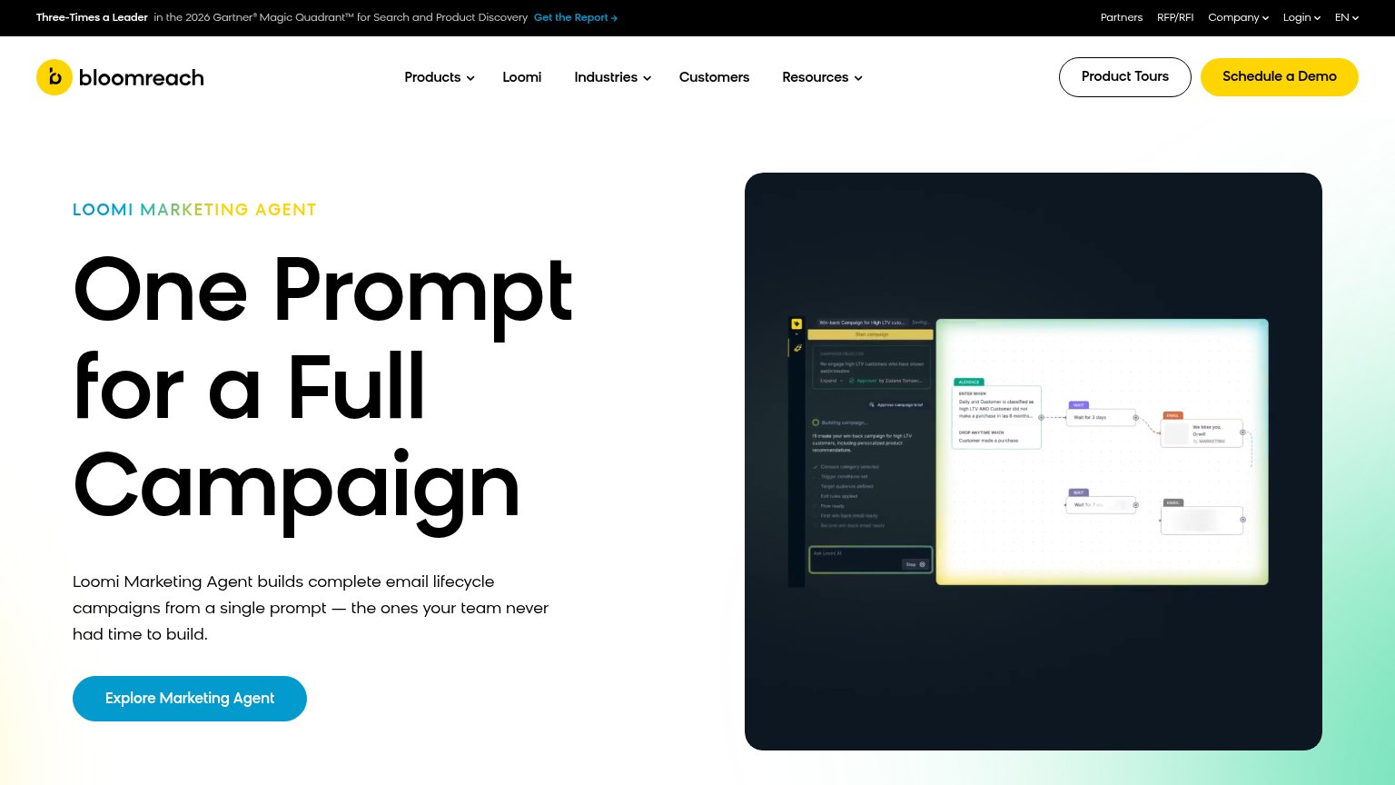 1234
- Schedule a Demo button — Yellow header CTA outweighs the hero's blue "Explore Marketing Agent", splitting the primary action across two competing styles.
- Top utility bar — Six exits (Get the Report, Partners, RFP/RFI, Company, Login, EN) sit above the headline and siphon attention before the pitch is read.
- Product Tours button — A third equal-weight header button adds another fork in the scan path right beside the demo CTA.
- Loomi screenshot panel — The campaign-builder UI text is too small to read, so the visual proves less than its footprint suggests.
CTA
68FairCopy, size, verb, cost-feel — does the primary CTA earn the click?
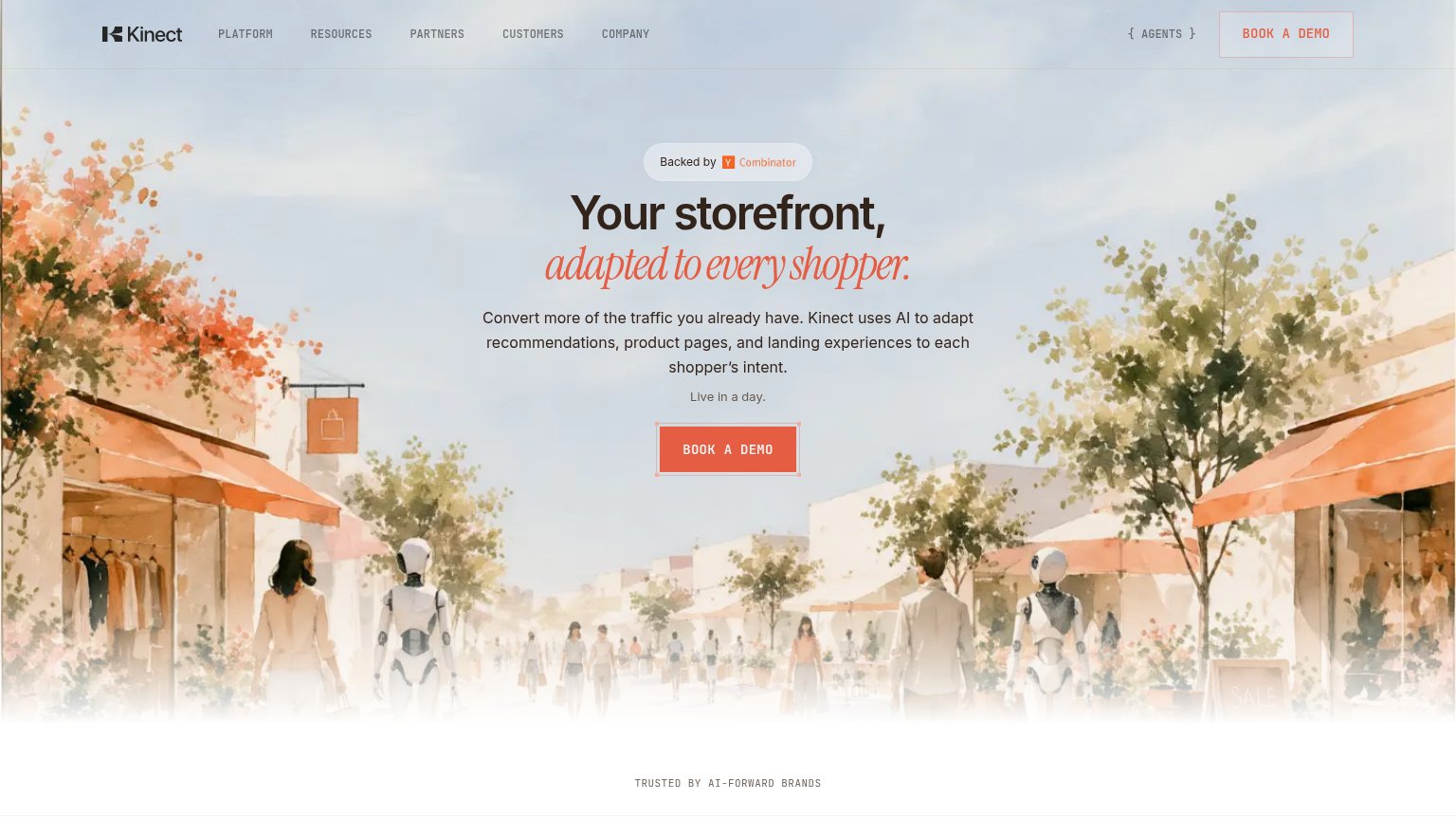
Problems
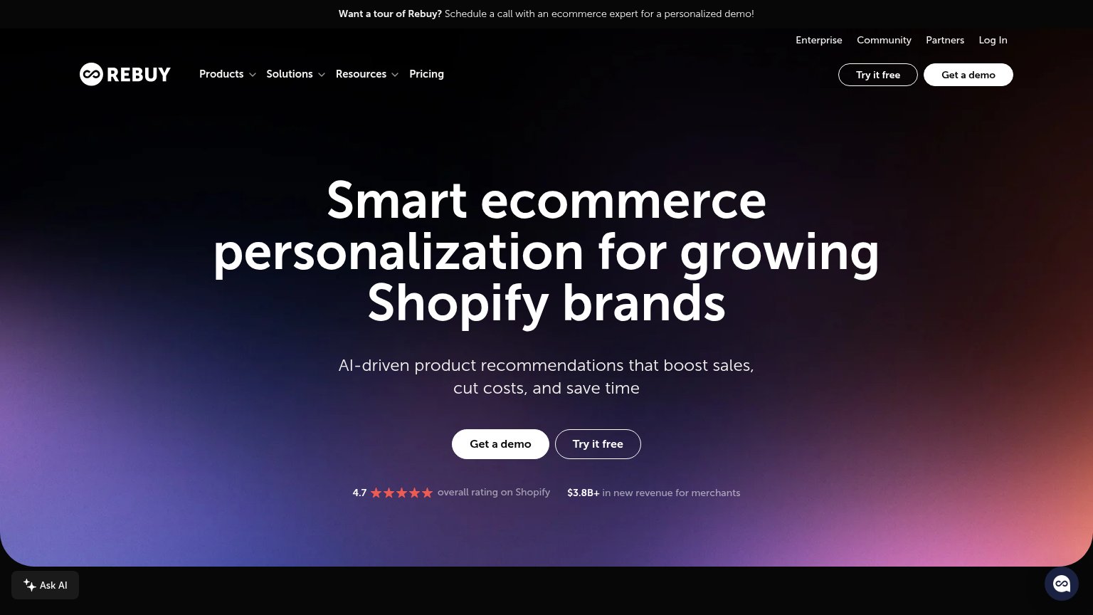
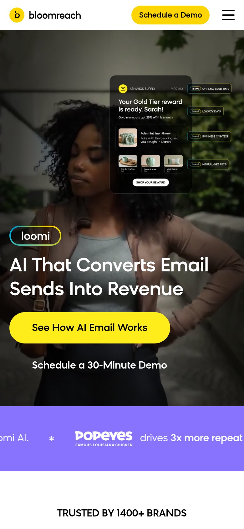
- mobile hero uses a different CTA
- 'Explore' is vague — no payoff named
- three competing labels on one fold
- doesn't complete the headline promise
Value props
82StrongTitle, subtitle, hero — do they sell the product's true value?
Bloomreach’s headline
One Prompt for a Full Campaign
Loomi Marketing Agent builds complete email lifecycle campaigns from a single prompt — the ones your team never had time to build.
Working
Could improve
Trust
82StrongProof that the product is real, competent, and safe to try.
How Bloomreach compares
Trust read
Mobile web
86StrongThe phone experience as a first-class citizen.
What works
What to improve