
Your landing page’s weakest score is Information hierarchy.
How AutoCut ranks
80Growth scoreupdated
category scores
category scoresShowHide
Information hierarchy
76FairDoes the design help or inhibit what the page is trying to say?
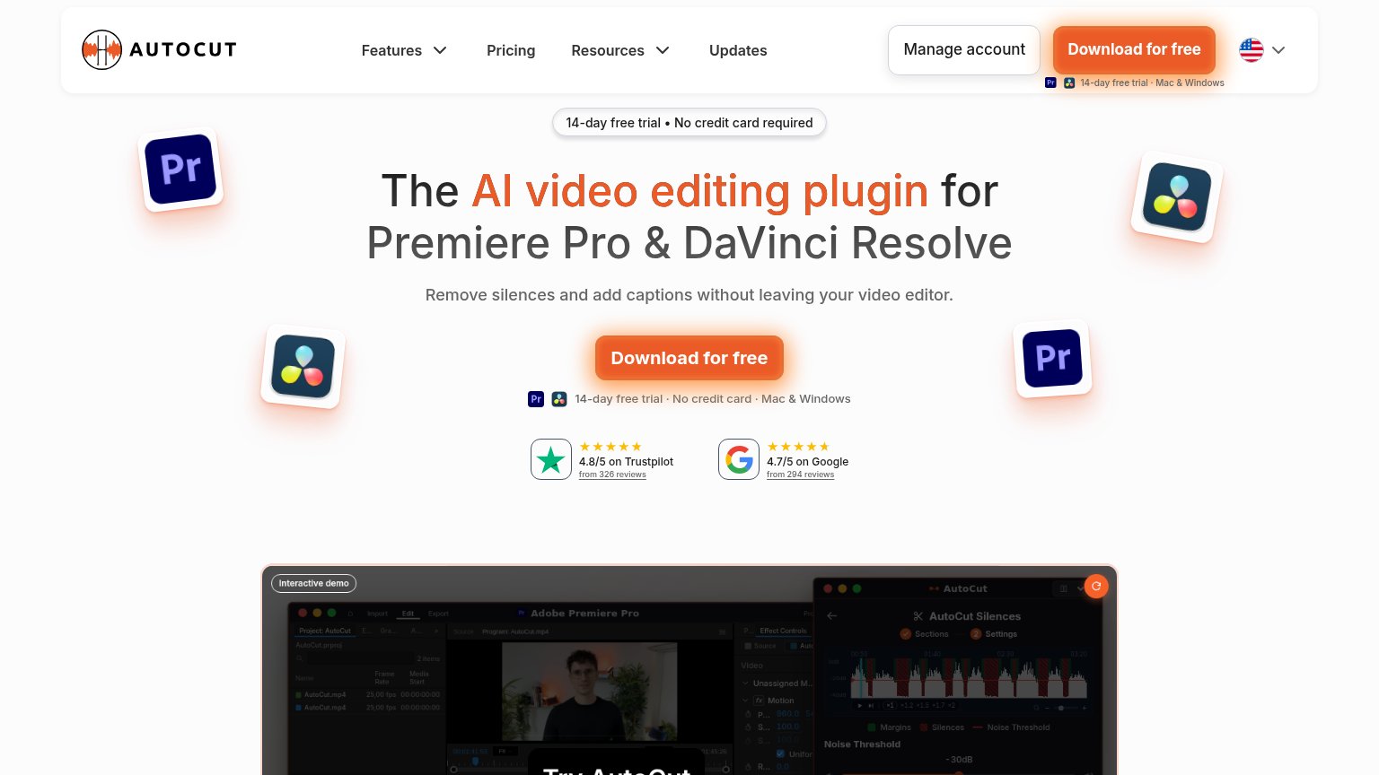 123
- Download for free (header) — Duplicates the hero CTA at equal visual weight, splitting the one-second scan between two orange targets.
- Manage account button — A bordered, button-weight control beside the primary CTA invites existing users and dilutes CTA focus for new visitors.
- Fine-print under nav CTA — Tiny trial/platform caption crammed under the header button is unreadable and visually noisy next to the nav.
Mobile web
76FairThe phone experience as a first-class citizen.
 1234
- Headline wraps five lines — The H1 scales down too little and wraps into five cramped lines, pushing the CTA block to the edge of the first viewport.
- Try free CTA — The full-width 'Try free for 28 days' button sits below the email field near the fold edge, so the tap requires a scroll on shorter phones.
- Struck-through 14 days — The crossed-out '14 days → 28-day free trial' reads as a pricing gimmick and contradicts the desktop's '14-day free trial' copy.
- Header Download button — A second 'Download for free' CTA in the sticky header competes with the hero's 'Try free for 28 days' form, splitting the primary action.
Value props
78FairTitle, subtitle, hero — do they sell the product's true value?
AutoCut’s headline
The AI video editing plugin for Premiere Pro & DaVinci Resolve
Remove silences and add captions without leaving your video editor.
Working
Could improve
Trust
82StrongProof that the product is real, competent, and safe to try.
How AutoCut compares
Trust read
CTA
86StrongCopy, size, verb, cost-feel — does the primary CTA earn the click?
How AutoCut compares
Recommended rewrites