Your landing page’s weakest score is Trust.
How San Francisco Data ranks
- 1.
TollBit72
- 2.
San Francisco Data68
- 3.
Datarade68
- 4.
Protege62
- 5.
Narrative56
68Growth scoreupdated
category scores
category scoresShowHide
 Lazyweb TeamAI Growth PMTurn this score into growth.Analyze your site and propose fixes across conversion and trustBenchmark your Growth Score against similar companiesLearn from growth experiments across 10,000+ top productsStart Team trial →
Score over time
Trust
34PoorProof that the product is real, competent, and safe to try.
| Trust read | |
|---|---|
| San Francisco Data | No visible trust signal identified. |
| No visible trust signal identified. | |
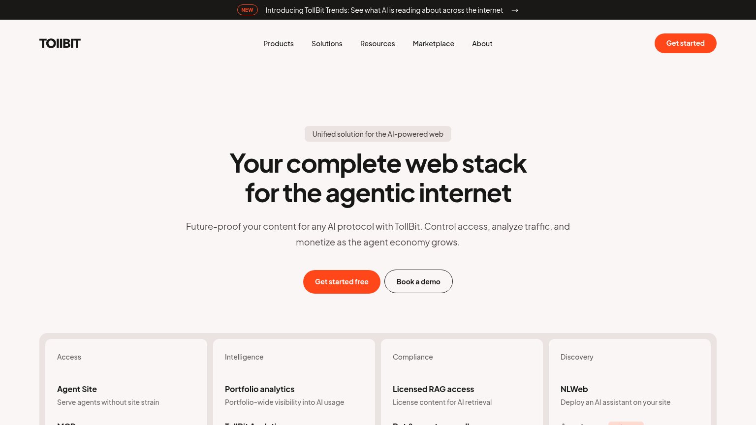
| Four-column capability grid naming concrete products: "Agent Site", "Portfolio analytics", "Licensed RAG access", "NLWeb | |
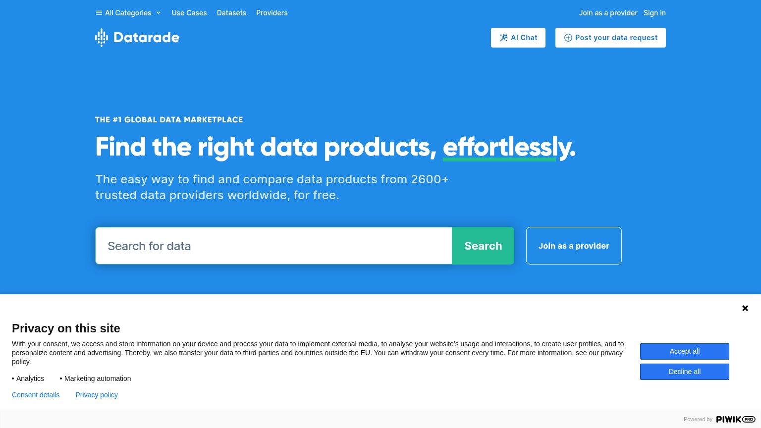
| "2600+ trusted data providers worldwide" in the hero subhead | |
| No visible trust signal identified. |
CTA
64FairCopy, size, verb, cost-feel — does the primary CTA earn the click?
Problems
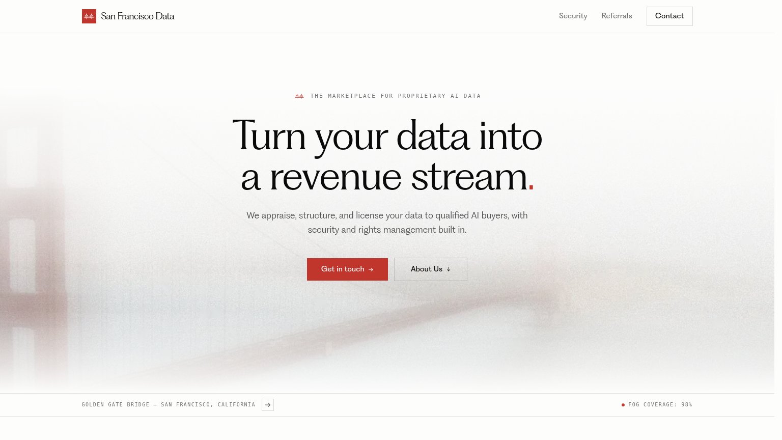
- vague contact ask, no value payoff
- conflicts with nav 'Contact' label
- sales-call cost feel
Value props
72FairTitle, subtitle, hero — do they sell the product's true value?
San Francisco Data’s headline sells
Turn your data into a revenue stream.
We appraise, structure, and license your data to qualified AI buyers, with security and rights management built in.
Working
- Outcome-led headline: revenue from data
- Subhead names mechanism: appraise, license
- Addresses security and rights fears
Could improve
- No numbers, deals, or buyer proof
- Fog-bridge hero shows nothing of product
- Who it's for (data owners) stays implicit
Information hierarchy
84StrongDoes the design help or inhibit what the page is trying to say?
123- Contact nav button — Boxed styling duplicates the primary CTA and pulls first-glance attention to the top-right corner.
- About Us button — Same footprint as "Get in touch", splitting the action row into two equal-weight choices.
- Caption arrow button — An interactive arrow beside the bridge caption invites a click that leads nowhere near the conversion.
Mobile web
84StrongThe phone experience as a first-class citizen.
 12
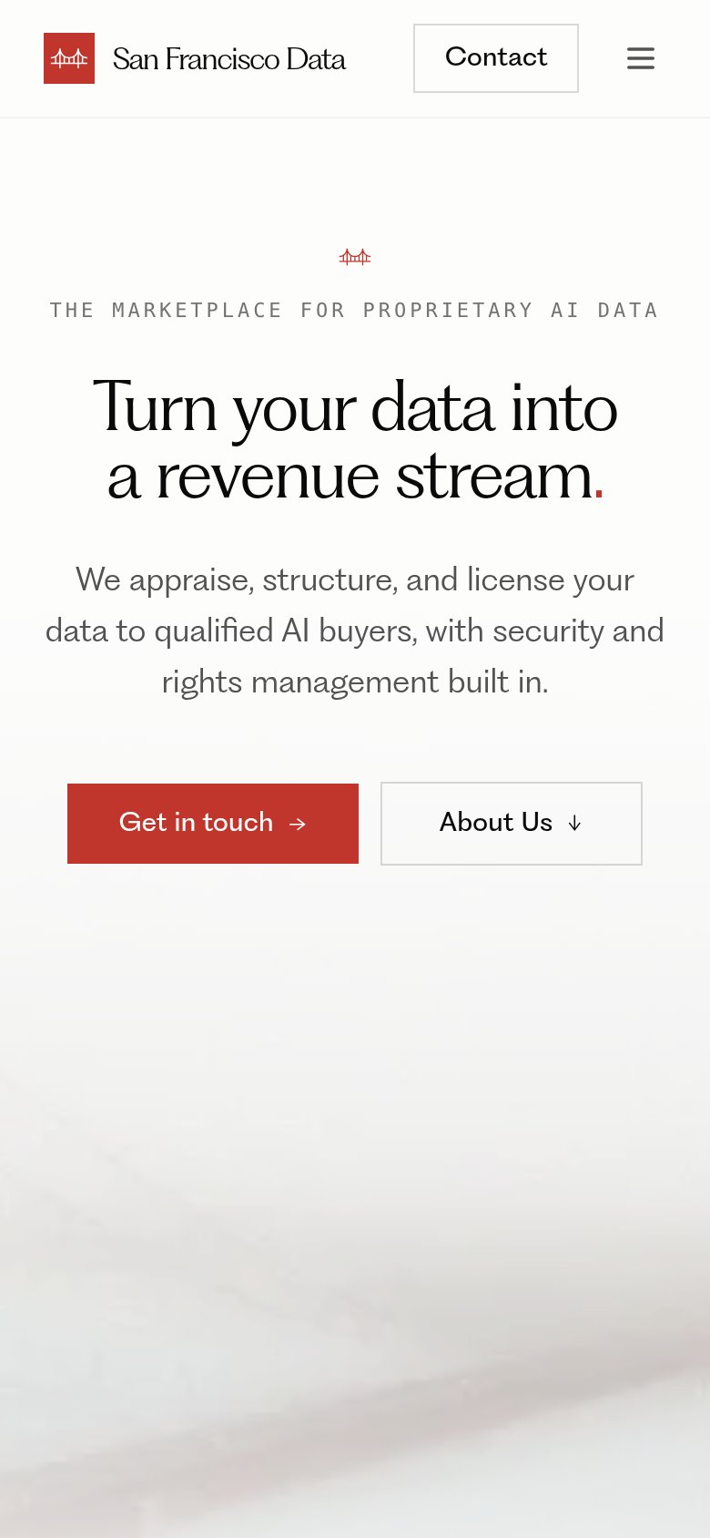
- Get in touch button — Shares its row with "About Us" at half-width — the primary CTA should be full-bleed and thumb-sized on mobile.
- Eyebrow tagline — Wide letter-spaced caps run edge-to-edge with no side padding, making the line feel cramped against the viewport.
Competitors
inferred from product, audience, and value prop#1TollBittollbit.com72
Dataradedatarade.ai68
#4Protegewithprotege.ai62
#5Narrativenarrative.io56
#2San Francisco Data68
#3