Your landing page’s weakest score is Trust.
How OneGC ranks
76Growth scoreupdated
category scores
category scoresShowHide
 Lazyweb TeamAI Growth PMTurn this score into growth.Analyze your site and propose fixes across conversion and trustBenchmark your Growth Score against similar companiesLearn from growth experiments across 10,000+ top productsStart Team trial →
Trust
62FairProof that the product is real, competent, and safe to try.
| Trust read | |
|---|---|
| OneGC | "BACKED BY" investor logo row: a16z speedrun, Tusk Venture Partners, Montauk Capital |
| No visible trust signal identified. |
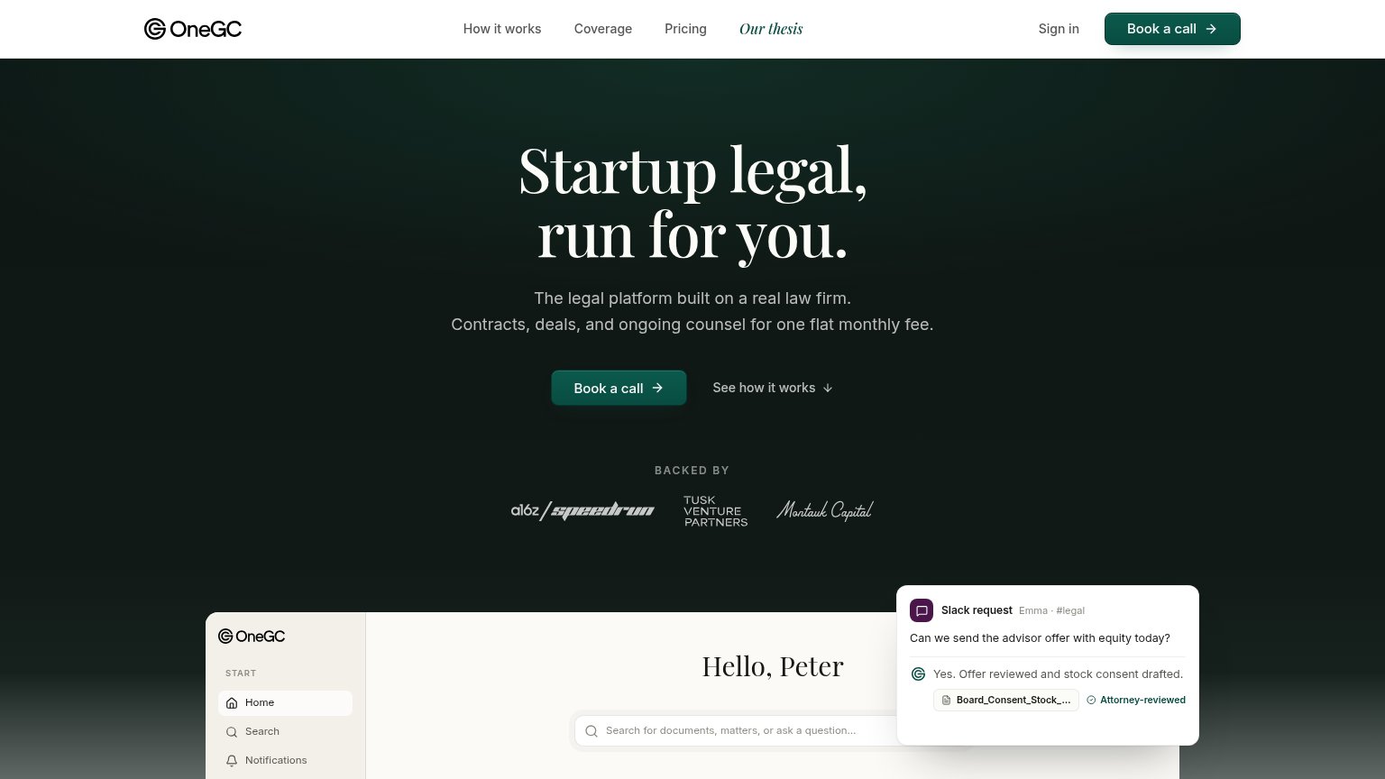
CTA
72FairCopy, size, verb, cost-feel — does the primary CTA earn the click?
Problems
- call feels costly, high-commitment
- click delivers a meeting, not value
- no self-serve path visible
Value props
78FairTitle, subtitle, hero — do they sell the product's true value?
OneGC’s headline sells
Startup legal, run for you.
The legal platform built on a real law firm. Contracts, deals, and ongoing counsel for one flat monthly fee.
Working
- 'run for OneGC' sells done-for-OneGC relief
- 'real law firm' preempts the AI-only doubt
- Slack demo shows the product doing the job
Could improve
- No price despite 'flat monthly fee' claim
- No turnaround or speed number
- Investor logos are the only proof point
Information hierarchy
84StrongDoes the design help or inhibit what the page is trying to say?
123- Our thesis nav link — Italic accent styling makes this exit link the most eye-catching nav item, pulling attention from Book a call.
- Nav link cluster — Five links plus Sign in give seven above-fold exits competing with the single conversion action.
- Cropped product preview — The dashboard and Slack card enter the fold mid-element, adding visual noise without a readable payoff.
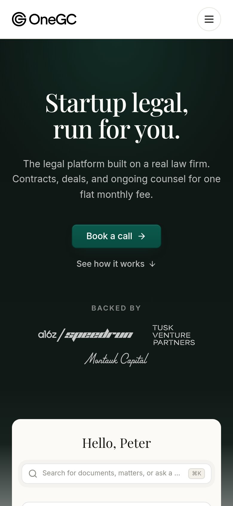
Mobile web
86StrongThe phone experience as a first-class citizen.
 12
- Book a call button — Desktop-proportioned width; should stretch near full-bleed for thumb reach.
- ⌘K shortcut chip — Desktop keyboard hint is meaningless on a phone and adds clutter to the search field.