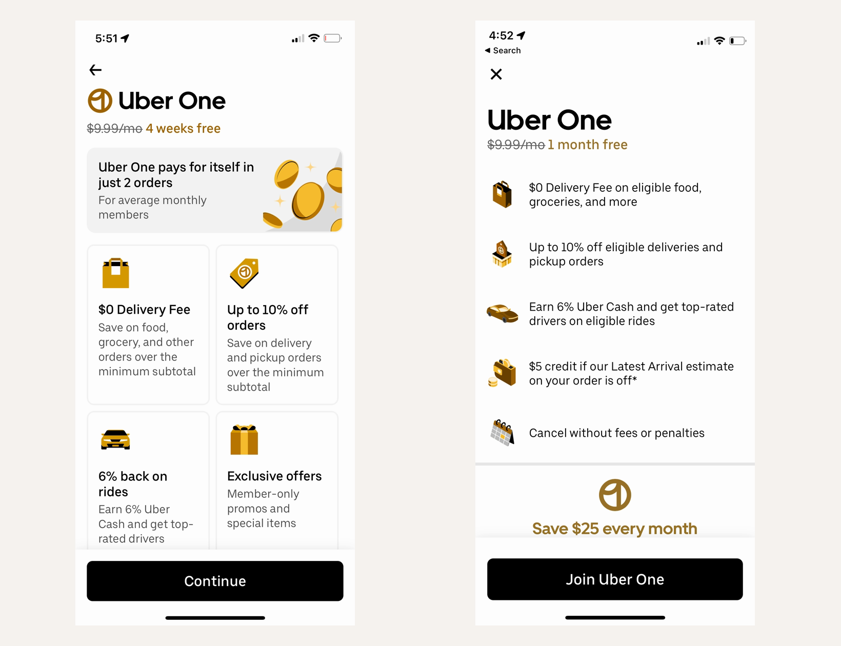
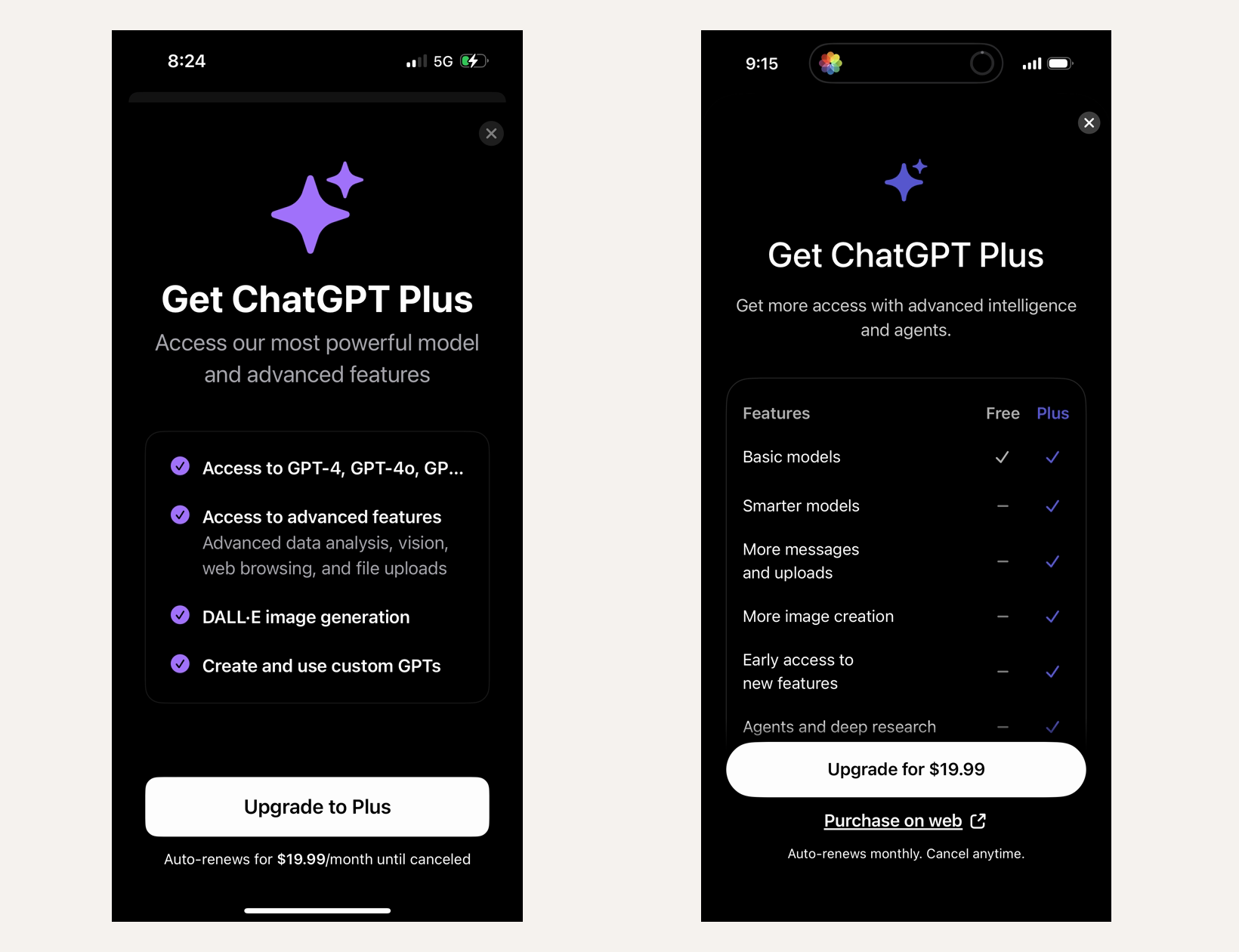
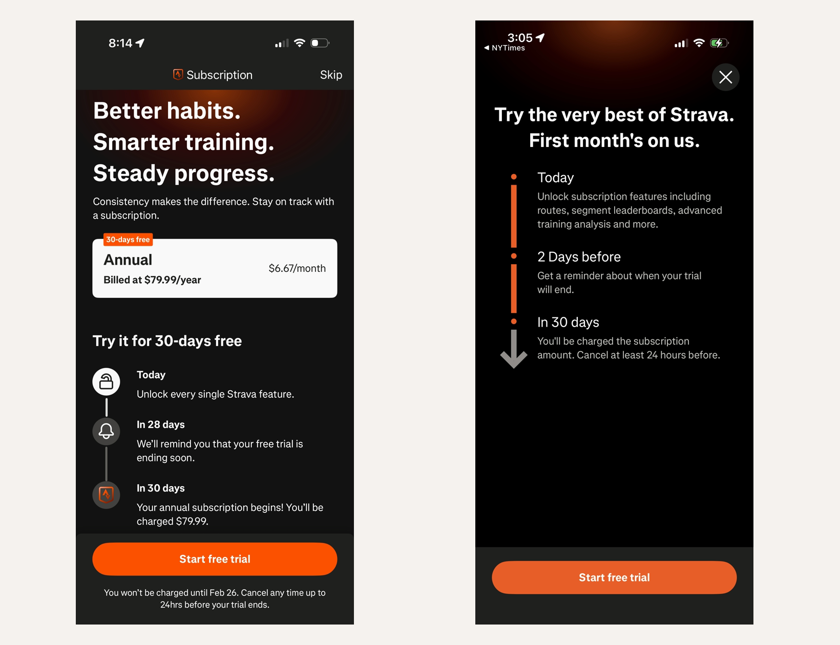
How should apps show limited-time subscription discounts in paywalls?
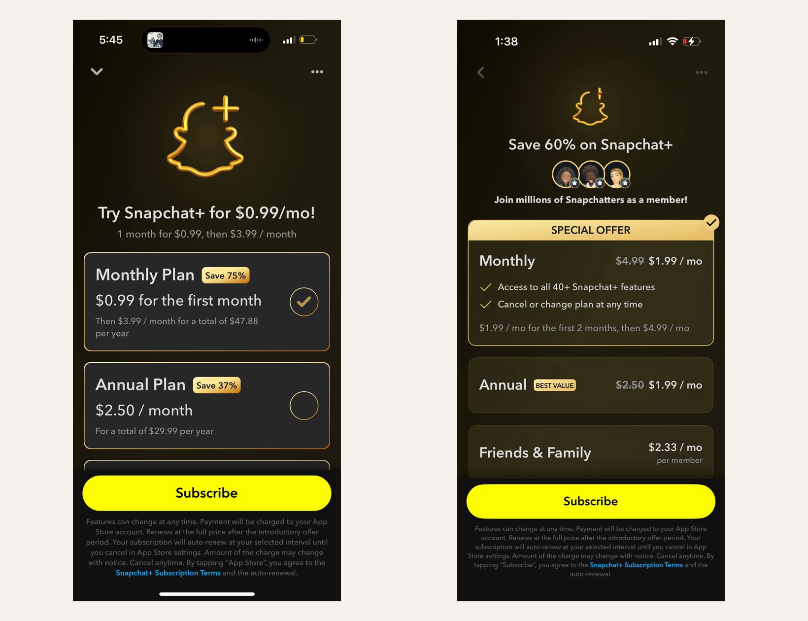
Make the discount impossible to miss, then guide users toward the intended plan. Snapchat changed the paywall headline to a 60% savings claim, added multiple discounted plan cards, marked annual as BEST VALUE, and put a SPECIAL OFFER badge on the purchase surface.
- By Ali Abouelatta
- 3 visuals
- 1 min read
- monetization · pricing · paywall · conversion
The evidence
Lazyweb Research compared Snapchat Plus screenshots where the experiment increased offer salience with percentage savings, tiered plan cards, annual-plan guidance, and offer badges.
What changed
- Control: price-focused headline and simpler subscription presentation.
- Experiment: Save 60% on Snapchat+ headline, multiple discounted plans, BEST VALUE annual marking, social proof avatars, and SPECIAL OFFER badge.
- The experiment changed both the offer framing and the plan-selection architecture.
Why it matters
- Discounts need visual hierarchy; burying the incentive forces users to calculate value themselves.
- Plan badges can turn a discount into a routing mechanism toward the higher-commitment option.
Every visual
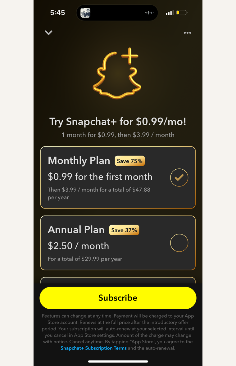
The control screen focuses on the subscription price and a simpler Snapchat Plus offer structure.760 × 1180opens the full image 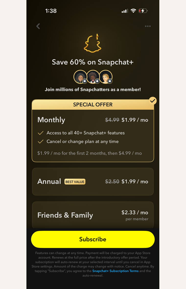
The experiment screen anchors the decision on a 60% savings headline, shows multiple discounted plans, marks the annual option as best value, and adds a visible special-offer treatment.760 × 1180opens the full image
Sources
- [1]
Lazyweb Research: Most up to date mobile A/B test library tracking +1000 apps weekly.
Methodology
Product-experiment write-up by Ali Abouelatta, dated on June 2, 2026. Source links are listed below.