Do Paywalls Use Feature Checklists or Benefit Carousels?
- By Ali Abouelatta
- n = 1,204
- Published
- Updated
- 2 min read
- paywall · ux-patterns · design · monetization · mobile
Short answer
Where the layout is documented, feature checklists outnumber benefit carousels roughly 2:1: 163 of 1,204 described paywalls mention a checklist or feature/benefits list versus 76 that mention a carousel.source[1] The static checkmark list is the more common way mobile paywalls present value. If you are choosing between a scrollable carousel and a checklist, the checklist is the benchmark default.
Feature checklists appear on 163 mobile paywalls versus 76 with a benefit carousel — about 2:1 among 1,204 described screens (Lazyweb Research, July 2026).
The finding
Checklist language — checkmarks, 'feature list', 'list of features', or 'benefits list' — is detected on 163 of 1,204 described paywalls.source[1] Carousel layouts are detected on 76.source[1] Where the value-presentation layout is described at all, checklists lead carousels roughly 2:1.source[1] Both are lower bounds from regex over vision descriptions.number[2]
Checklist vs carousel
| Value layout | Paywalls (of 1,204) |
|---|---|
| Feature checklist / benefits list | 163 |
| Benefit carousel | 76 |
The two are not mutually exclusive in every case, but the direction is clear: the static checkmark list is the more common pattern.source[1]
How to apply it
Default to a feature checklist when the paywall's job is to justify the price against a concrete set of unlocked features — it is the more common pattern and keeps the whole value list visible above the CTA.source[1] Reach for a carousel when the value is experiential and better shown than listed (before/after imagery, multiple use cases), accepting that only part of the value is on screen at once. Because both are minority-described (163 and 76 of 1,204), many paywalls present value in other ways entirely, so this is a choice between two documented options rather than a mandate.source[1]
Caveats
Both counts are lower bounds from LLM vision-description regex; a paywall with an undescribed checkmark row or an unlabeled swipeable panel is missed.number[2] Read the 2:1 as the relative preference among documented layouts, not as absolute coverage of the corpus.source[1]
Real in-market screens
Screens from real, in-market apps, tracked by Lazyweb Research.
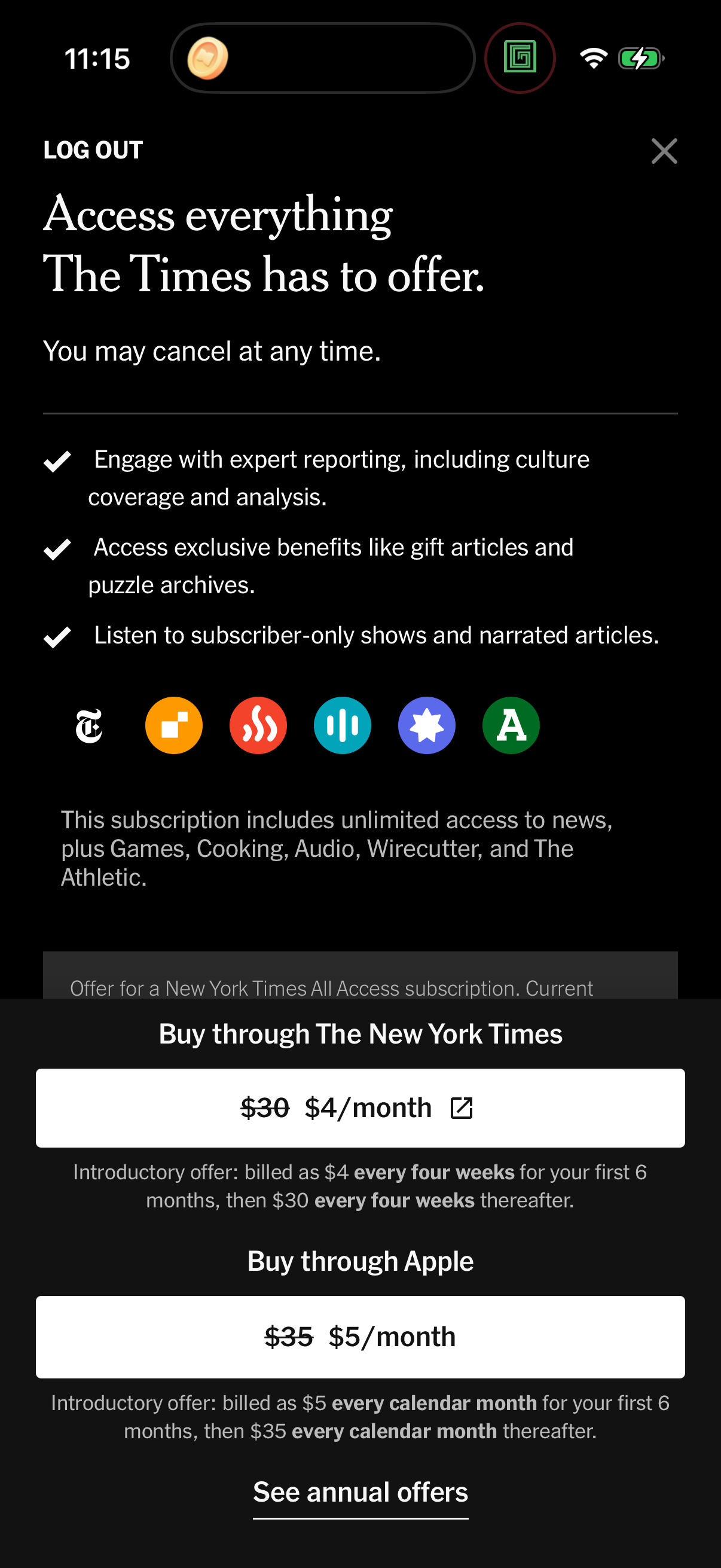
Nytimes1206 × 2622opens the full image 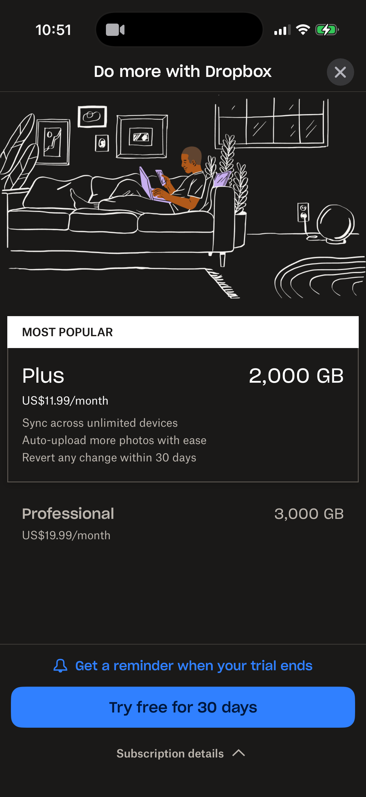
Dropbox1206 × 2622opens the full image 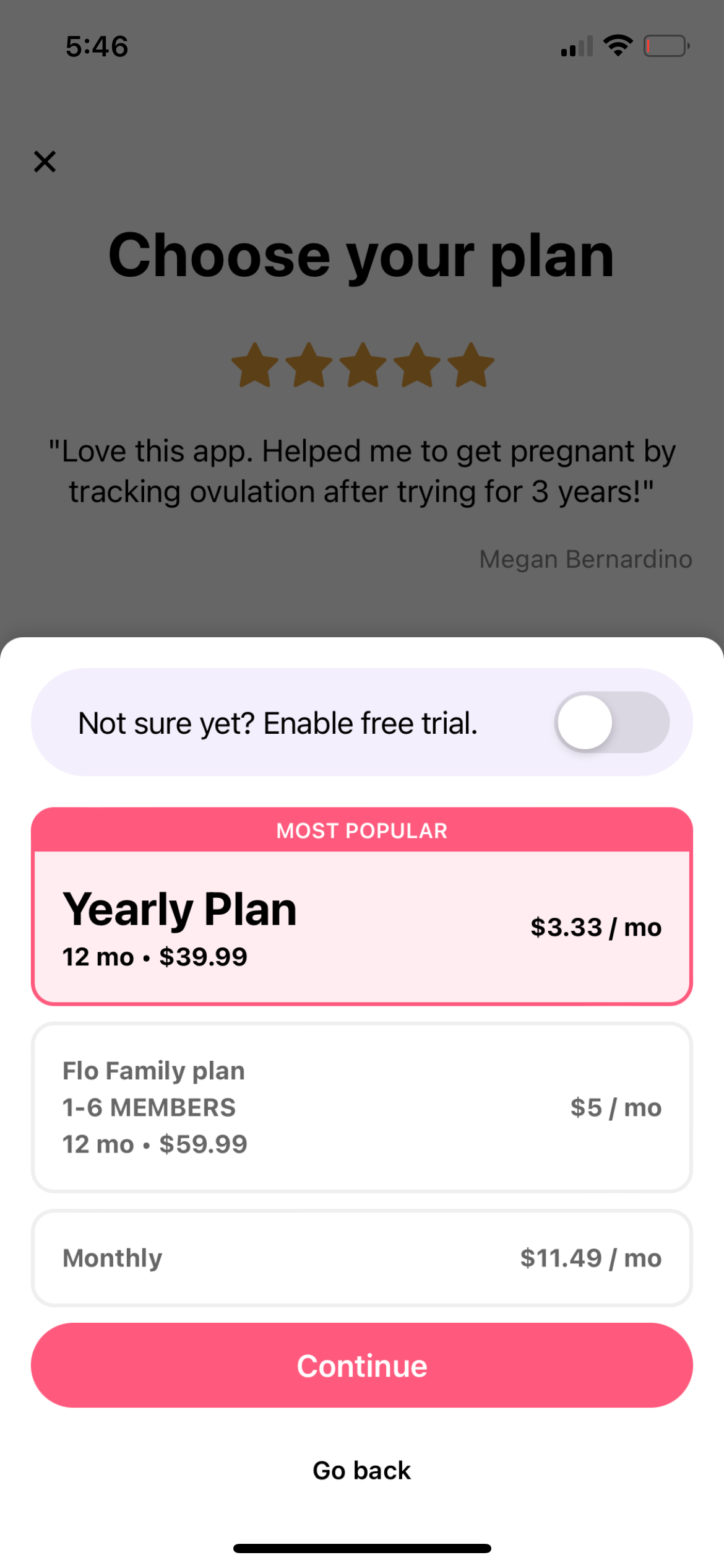
Flo1170 × 2532opens the full image 
Meitu1206 × 2622opens the full image
The numbers
| # | Stat | Computed from |
|---|---|---|
| [1] | checklist 163 vs carousel 76 of 1,204 described paywalls | feature_checklist_vs_carousel: checklist 163, carousel 76, n=1,204 |
| [2] | lower bound, description-regex based | feature_checklist_vs_carousel description: 'LOWER BOUND, description-regex based' |
Methodology
Universe: 1,204 mobile paywalls with vision descriptions across ~800 tracked apps. Checklist and carousel layouts detected by regex over LLM vision descriptions. July 2026 pull. Key caveat: both are lower bounds; undescribed layouts are missed.
Sources
- [1]
Lazyweb Research analysis of 1,204 described paywalls (~800 tracked apps), July 2026
Checklist and carousel layouts detected via regex over LLM vision descriptions (checkmark/feature list/benefits list vs carousel); both lower bounds.
Source: Lazyweb Research — proprietary analysis of real, in-market app screens. Cite as Lazyweb Research, 2026-07-07.