What did AllTrails learn from testing a boring sign-up screen?
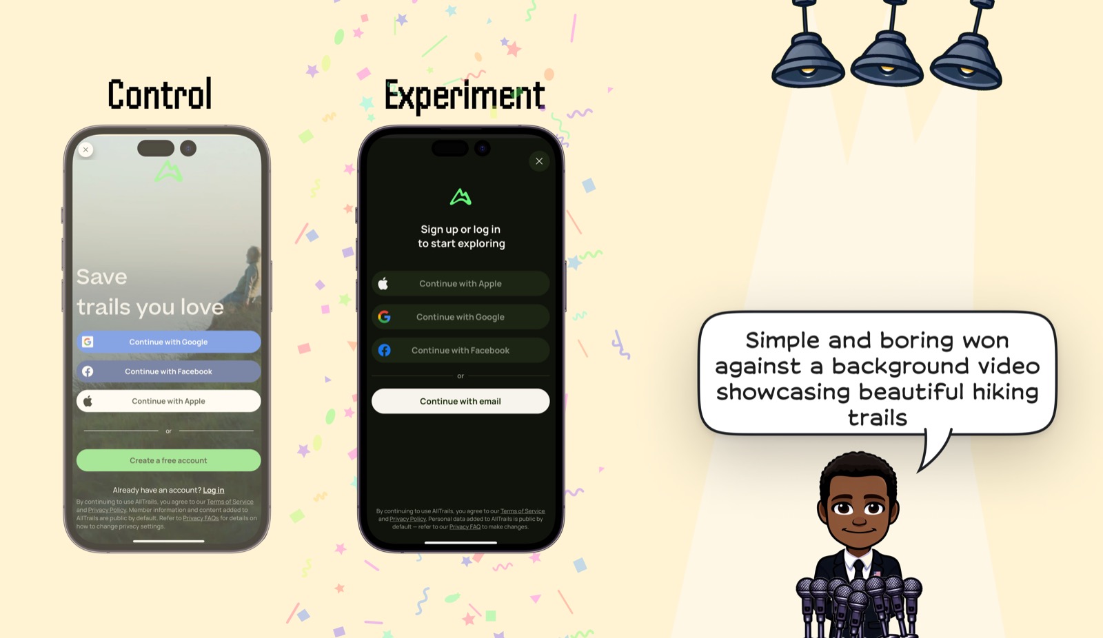
AllTrails' simpler signup screen beat a version with a scenic hiking-trail background video. The winning screen kept the brand mark, direct signup/login language, social login buttons, and email continuation without letting the outdoor imagery compete with the auth choices.
- By Ali Abouelatta
- 1 visual
- 1 min read
- signup · onboarding · conversion · video
The evidence
The AllTrails comparison shows a video-backed control next to a plain, darker experiment with the same core signup/login job made more legible.
What changed
- Control: a scenic hiking background under multiple auth choices.
- Experiment: a dark, static screen with the logo, clear auth methods, and email continuation.
- The experiment moved the screen from scenic brand expression to direct account access.
Why it matters
- Category-relevant imagery can still reduce signup focus.
- Auth screens need legibility and choice clarity more than atmosphere.
Sources
- [1]
Lazyweb Research: AllTrails signup-screen experiment
The AllTrails example shows a simple signup screen winning against a background video showcasing hiking trails.
Methodology
Product-experiment write-up by Ali Abouelatta, dated on August 2, 2024. Source links are listed below.